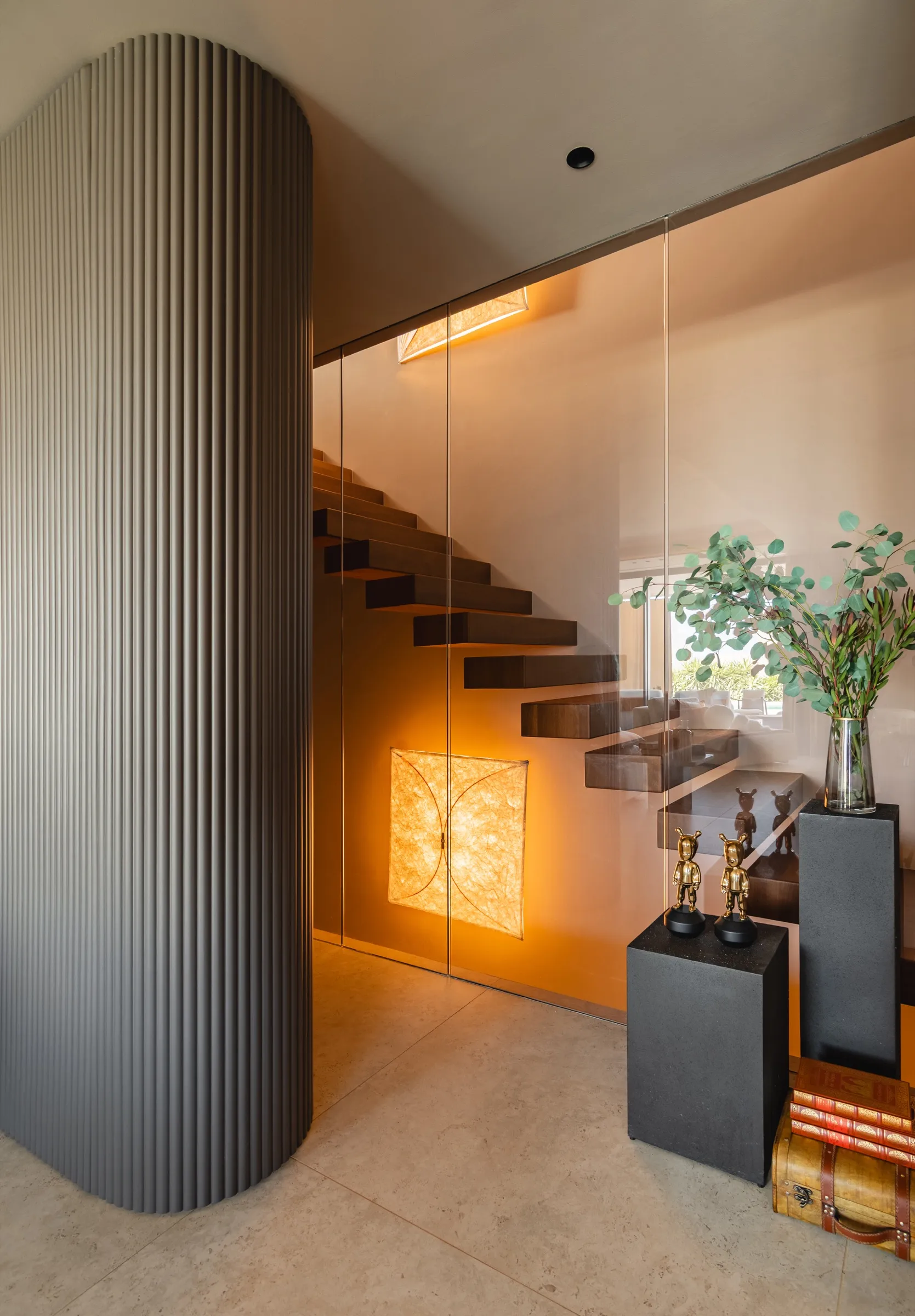
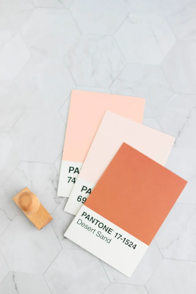
Choosing the right colour palette for your home, and especially for your kitchen, is one of the most important decisions when designing a space. Colours influence the aesthetics, atmosphere, perception of spaciousness and, more generally, the feeling that a space conveys. As we know how important this is throughout the design process, here are some tips for choosing the perfect colour palette:
Strategic combinations according to your home’s style
The style of your home plays a fundamental role in choosing colours. If your space has a modern aesthetic, you can opt for neutral tones combined with more vibrant colours to add dynamism. If your style is more classic or traditional, warm tones such as beige, brown and cream can bring elegance and sophistication.
Tip: Think about the coherence between rooms. If the kitchen is part of an open-plan space, the colour palette should complement the rest of the areas.
Visual harmony
Harmony is key. When selecting a palette, look for colours that complement one another, creating asense of balance. You can opt for a monochromatic combination (different shades of the same colour), an analogous combination (colours that are close to each other on the colour wheel) or a complementary combination (opposite colours that nevertheless work harmoniously together). You can learn more about these combinations in the Adobe Color Guide to Colour Theory.
Tip: Use a 60-30-10 ratio when distributing colours. 60% should be a dominant colour, 30% a secondary colour and 10% an accent colour. This will ensure everything feels balanced.
Good taste never goes out of style
Sometimes, less is more. Opt for timeless palettes that are not only fashionable but can also stand the test of time. Neutral colours such as white, grey and black can provide the perfect foundation for any style. Adding subtle touches of colour through accessories or finishes can give the space a unique character without overwhelming it.
However, sometimes, more is more. If you have a more creative and experimental approach, or if you already have experience playing with colour combinations, you can dare to incorporate more vibrant or unusual shades. Intense and contrasting colours, combined with a balanced design, can result in a unique space full of character.
What do you want your kitchen to convey?
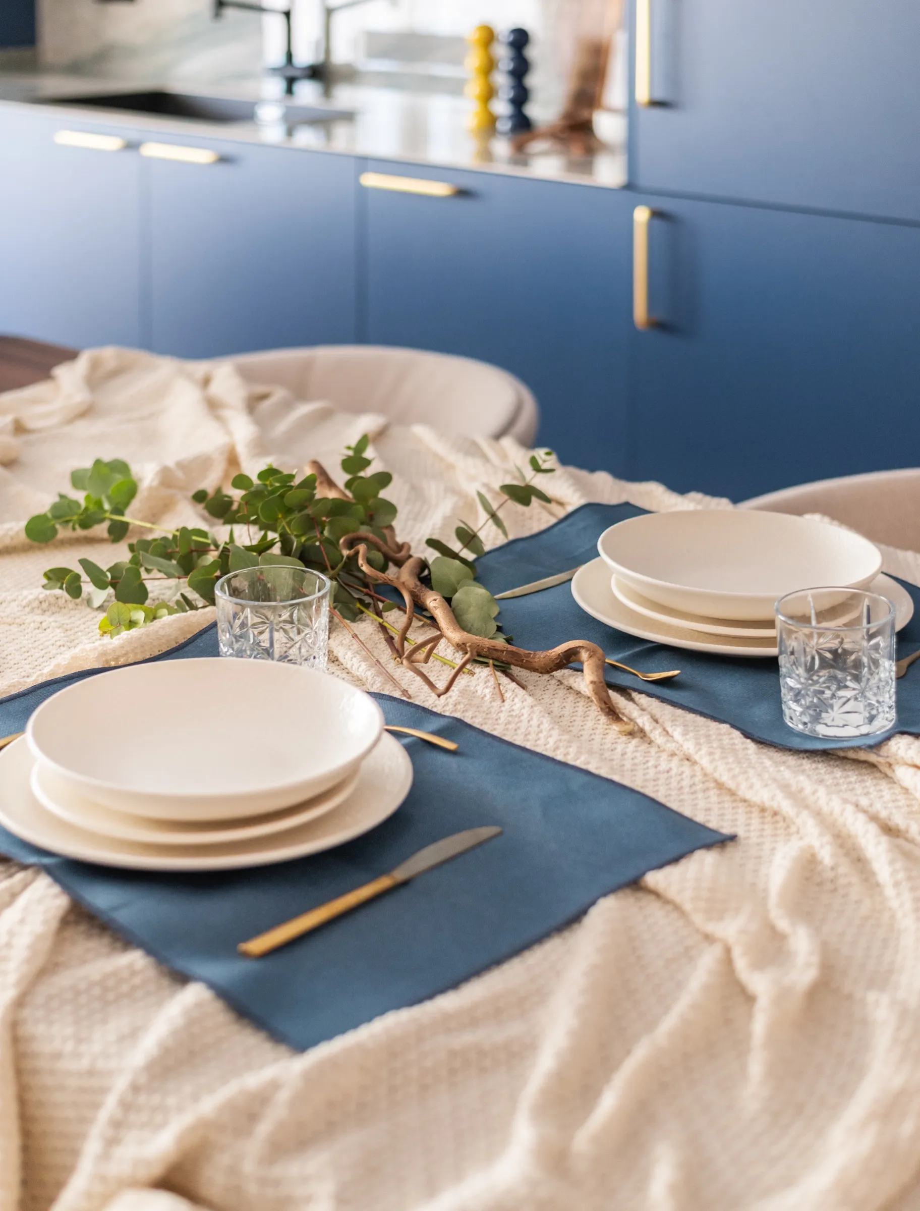
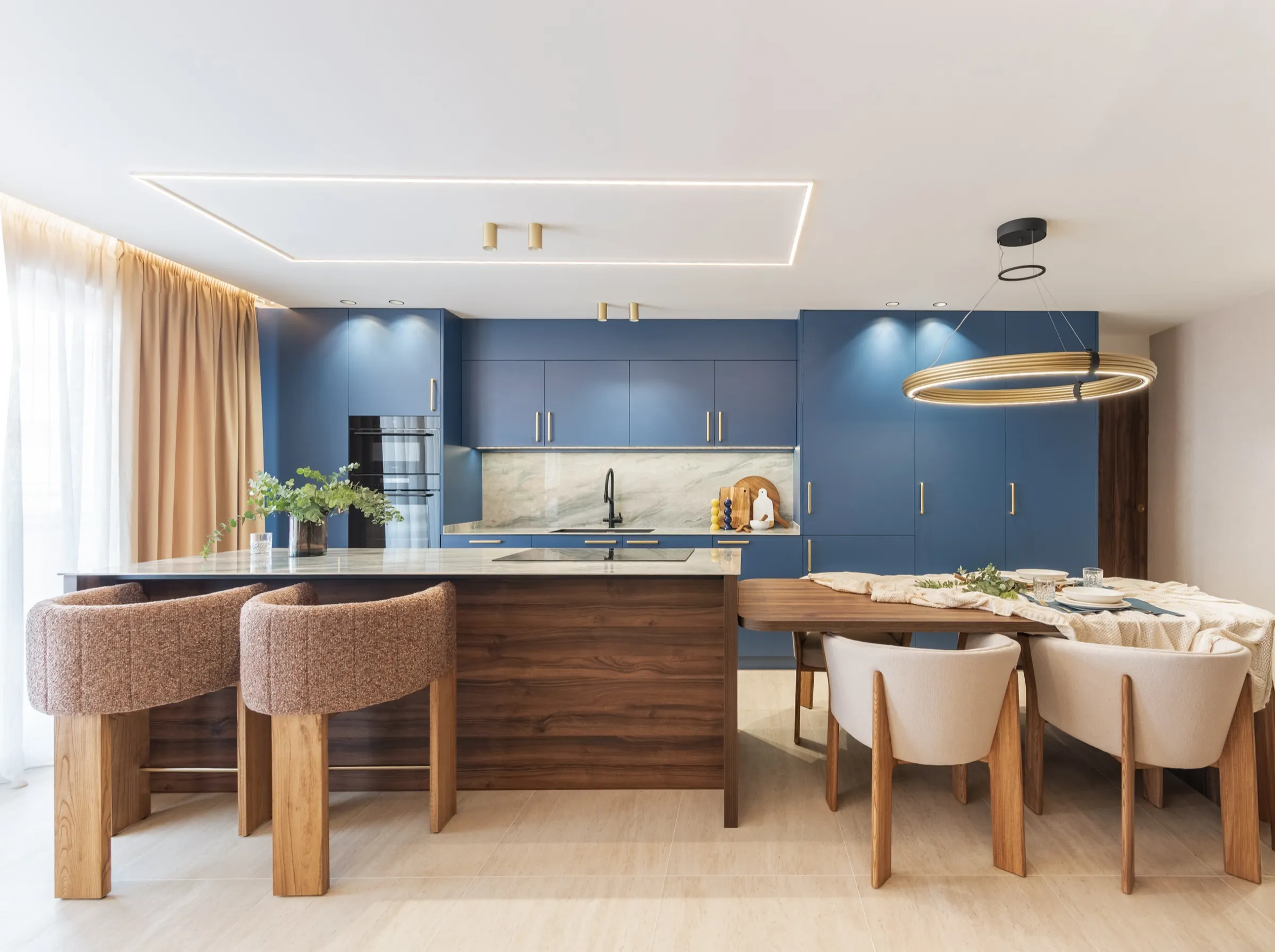
What feeling do you want to create in your kitchen? If you want a bright and airy kitchen, light tones such as whites, beiges and soft greys may be the best choice. If you are looking for something more vibrant, energetic and modern, you can choose more intense shades such as navy blue, emerald green or even metallic colours. Think about the atmosphere you want to create and how colours influence it.
Practical tip: Warm colours (reds, oranges and yellows) tend to create a feeling of warmth and energy, while cool tones (blues and greens) usually evoke a sense of calm and freshness.
The materials you choose will also have an influence
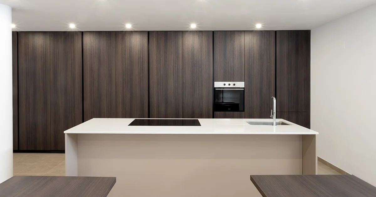
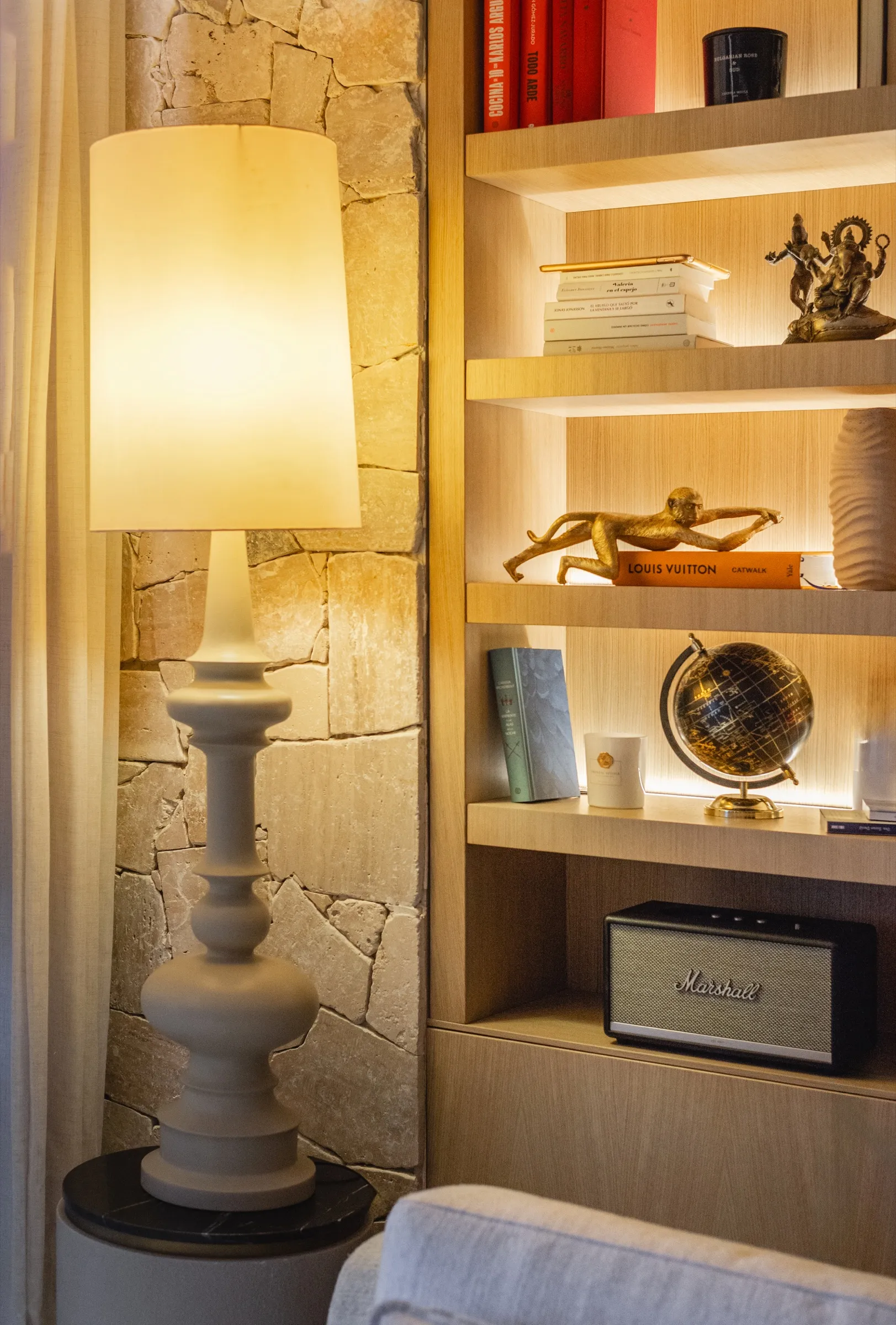
If you opt for materials such as wood or natural stone, neutral and warm tones can enhance the beauty of these surfaces. If you prefer a more modern and minimalist aesthetic, matt colours, greys and metallics are ideal options to complement materials such as glass.
Tip: Reflective surfaces, such as glossy tiles or marble, can reflect more light, so you could choose darker tones to balance the light and create an attractive visual contrast.
The surroundings: natural light and available space
The amount of natural light your kitchen receives influences how colours will look. If you have a kitchen with plenty of natural light, you can opt for darker colours to create an interesting contrast. If natural light is limited, lighter colours can help brighten the space and make it appear larger.
Practical tip: Light tones also help maximise the feeling of space, while darker colours can make a small area feel cosier and warmer.
Choosing the perfect colour palette for your kitchen involves considering the style of your home, the materials you will use, visual harmony and, of course, the atmosphere you want to create. Taking the time to consider each of these factors will allow you to design a unique, practical space full of personality.
To put what we have discussed into practice, here is a colour palette that we were recently asked to create for a kitchen project:
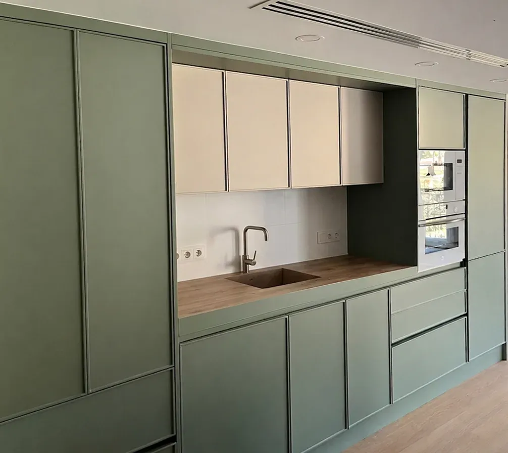
- Aquamarine – A fresh and relaxing shade, ideal for creating a tranquil atmosphere.
- Sand – A warm and soft colour, perfect for creating a sense of spaciousness and serenity.
- Gold Oak worktop – A wood finish that adds quality and a touch of luxury. This colour combination creates a balanced and harmonious atmosphere, blending freshness with elegance. The soft tones complement the luxurious touch of Gold Oak, creating a kitchen that is modern, welcoming and timeless.